Concept sketches for Module 3:
1 & 3 Issue: Eating disorders-
1. The idea for this poster is a casket on its way into a cemetery. The casket will be rested upon a scale. The reading on the scale would show the result of "too late". This poster would represent how eating disorders can lead to death if not addressed and treated in time. This could go for multiple eating disorders on both ends of the spectrum from obesity to anorexia. The image would have a gloomy feel with lots of shadows and possibly a black and white fade into the distance of the cemetery.
3. This poster would show that eating disorders/image issues can effect people of all sizes. There would be an overlay of people of different sizes in the center tied together with a measuring tape(representing a restraint). The words "Size matters" would be coming from the different bodies as thoughts. The text would be manipulated to show movement as the thoughts rattle the minds of all of the people. Different scale readings would be scattered across the image to show how it can become such an overpowering part of a person's life.
2,4,5 & 6 Issue: Racism-
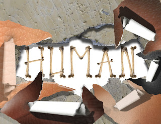
2 & 4. The concept behind these sketches is that underneath all of our different skin colors, we are all human. Taking actual images of skin and creating a layer mask to show the skin being peeled back would reveal the words underneath. Using textures and shadows to create depth and the layers under the skin. Once I got started with these concepts in Photoshop, they were not coming together as I had originally hoped. The concept wasn't coming across clear enough.

5. In this sketch, I took the definition of human and picture it overlaying different skin tones. The words will create the unity between the text and layers in the background. The font would be a typical dictionary font with shadows cast on the skin tones. The text would be crisp as well and the images of skin would be zoomed in to show details such as pores so people could recognize the texture.
6. Using the same textures from the ideas in sketches 2,4 and 5, I would have the word human in all directions in all different skin tones. With the concept that no matter which way you put it, or what color it is, the word remains the same.
7,8 &9 Issue: Abuse-
7. A child (bright in color) crouched in a dark corner with the insulting words blasting down from the opposing corner. The text would be harsh and spread to create the darkness surrounding the child. A large profile of an adult in the top corner, colored in a deep red with a screaming mouth spewing the words towards the child.
8. This sketch shows the idea of a woman, dressed in a clean and tailored suit. With a layer, create the clothing as a layer with a low opacity to reveal the bruises and abuse hidden underneath. This poster would show how abuse should not be kept hidden. Harsh words radiating off of the beautiful woman.
Possibly using gray tones for the clothing, color for the marks and abuse and reds for the words.
9. The concept behind this sketch is that children that are abused are afraid to tell anyone. It would show a child holding a stuffed animal and sharing the secret and tears with the stuffed animal. The text would say "shhhhh" in a soft font to represent that the secret should not be heard. A general darkness to the poster as secrets tend to be dark.
10, 11 & 12 Issue: Homelessness (specifically veterans)-
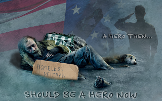
The last 3 sketches are based on the same concept. They show a homeless veteran in different settings, 10: on a city bench, 11: in front of a memorial statue and 12: laying on the street under an American flag. Each would display a sign "homeless veteran". With images in the background of the past; medals, saluting soldier, where the veteran was a figure of honor...a hero. The message for these posters would be that these men and women served and protected our country, they should be protected from ending up homeless on the streets. The colors would be ranging hues from patriotic reds and blues to grays that are dark and gloomy. The text would be similar to what you would see hand written on a cardboard sign.


