Wednesday, June 22, 2016
Module 6 Final
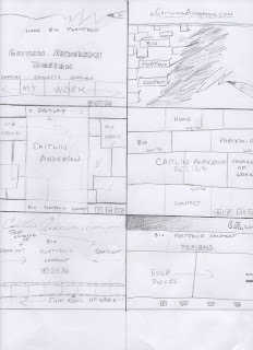
For the final project, I wanted to create a homepage to showcase the designs I created during this course. Making something that was visually appealing and representative of my current skills was my main goal. I used the final projects from each module as well as some other pieces that I had worked on through this learning process. I laid them out in a collage as the background for the page. I created an overlay where I set my text. I used the 3D tool to create interest in the text of my name so it would be interesting yet not over powering. I wanted the text tabs to appear as negative space in the semi transparent section in the center. I also inserted links to the social media sites that could be used as an alternative platform for my work. I found keeping the layout clean and easy to navigate would be beneficial.
Module 6 Sketches
For the final module, I wanted to come up with some layouts that were easy to follow and visually appealing. Coming into it I thought it would be hard to sketch ideas for a design with just layout based components. I realized through the sketches that I was running through the tools of photoshop as I drew each sketch which really helped with the process. In the end I think I was uniform in most of my concepts. Emphasizing the presence of example work to draw the eye and simple tabs that would lead to more detailed examples and representations of my abilities.
Here is some of the layouts I started playing with:
Tuesday, June 7, 2016
Module 5 final
Here is my final design for the Avatar project. I wanted to create an avatar that gave the feeling of being a warrior. I wanted there to be an intensity in her eyes that showed power and strength. I used numerous layers to create the skin tone, shadows and highlights. Using techniques learned in the tutorials, I tried to make the "avatar" become the focus. I adjusted the brightness of the leaves to be a bit darker to contrast the brightness of the figure. I took the face mask, the head piece and the spears from other images and hopefully blended them well enough that they don't look foreign in the final design. I increased the size of her eyes, flattened her nose a bit and pointed her ear using manipulation tools such as feathering, liquefy and the resizing tool along with masks to get a cleaner look. In the end, with all the little pieces, it took 40 layers to come to this final image(I had to count them because I thought it was getting a little crazy).
This was a variation I liked also, it gave me the feeling of an ice princess or something along those lines. This was acquired by playing with the hue/saturation of different layers.
Here are some of the images I used:
This is the original photo I took of him along with some other images I used:
:
Sunday, June 5, 2016
Module 5 Sketches
These are the concepts I came up with for module 5. When I think about an avatar, I think of warriors and nature. I tried to incorporate that into my drawings. I emphasized the features on my avatar creatures and placed them in positions I would imagine they would be out in the woods. I would like to create an image which shows how they would be one with nature. Without showing color in the sketches I don't think they are as powerful as the final image will be but I know I will have a broad span of options when it comes to effects with color.
Sunday, May 22, 2016
Module 4 book cover
Here is what I came up with for my final design. I wanted to make the cover bright yet deep. I transformed the pupils texture into colorful piano keys by adding three different layer at different opacities. Using the dodge and burn tools to adjust the shadows in the eye made the added layers blend with the eye base. For the background I wanted there to also be texture but not be a distraction. So I used an image of concrete and an image of sheets of music. I made them black and white and the adjusted the contrast and brightness until it reached my desired outcome. I used an autograph as the text for my title as I felt it gave a personal connection to my artist. I allowed room on the back cover for a description of the book with the diagonal divide of the piano keys.
Saturday, May 21, 2016
Module 4 sketches
These are the concepts I came up with for the musicians book cover. I tried to incorporate the instrument in some layouts and then showcase the musician in others.
Concept 1- Pianist:
In the first sketch I thought I would deconstruct and just use the keys of the piano with a 3d effect to create texture and draw the eye of a reader. The second would be the journey of the pianist with the keys as the path. The third, looking into the eye of the pianist with musical graphics in the background. The forth, a simplistic approach, a piano in the spotlight with aged hands on the keys as the back cover.
Concept 2- Violinist:
In the first sketch, a violin leaning in the corner with a spotlight on it, the back cover a close up of the violin. The second, a red book with a silhouette of a violin, details showing in sketched white. The back cover would show the neck of the violin with the same coloring and effects as the front. The third, splitting the violin down the spine of the book allowing room for text on front and back. The violin would be rich in color with a dark background to create contrast. The forth, a non detailed violinist with a paint texture, stroked of bright colors emphasizing the highlights. The back cover would be a close up with a bit more details showing a faint smile but still having the paint stroke effect.
Concept 3- Guitarist
The first, an eye catching guitar with bold color and graphics. The title in neon lights which would coordinate with the back cover showing a ad for the artist. The second concept would be a guitar pick with the artists name. A road map in the background showing that the book will take you on the journey. The back cover would be textured with guitar picks with the cities on the tour. The next concept would be the artist, holding his guitar, I'm still undecided on the background for this cover, could be in the middle of a field, or just a solid color. The back cover would be the lone stool with the mic in the spot light. My final concept is of a guitarist resting under a tree which would go up the spine. The guitar on the front cover, the artist on the back. Creating two different visuals that tie together when looked at as a whole.
Tuesday, April 19, 2016
Module 3 Poster

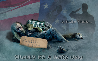
This is the final design I came up with for the Awareness Poster project. This poster shows a veteran sinking into the streets of homelessness. With a silhouette of himself in his youth in the background saluting the flag. Once looked at as a hero, now looked at as a nuisance. I used an image of a homeless man and added the sign to link him to the concept. I removed the background from the image and blended him in with the other layers to bring it together. I created shadows underneath the man so he did not look like he was floating in the center of the poster. I used the multiply tool to add the layer of the saluting soldier as it originally was a very bright image, as well as the flag. Using the burn and dodge tools I tried to balance out the texture of the ground. The font used was titled "felt tip senior" which I found to be fitting for this design. I hovered the text "A HERO THEN.." over the silhouette to connect the text to the idea and the remaining text in the foreground to emphasize the message. I added the cardboard on the diagonal as I thought it need something more to fill in the empty space, so I put it here both ways for opinions.
Module 3 Sketches
Concept sketches for Module 3:
1 & 3 Issue: Eating disorders-
1. The idea for this poster is a casket on its way into a cemetery. The casket will be rested upon a scale. The reading on the scale would show the result of "too late". This poster would represent how eating disorders can lead to death if not addressed and treated in time. This could go for multiple eating disorders on both ends of the spectrum from obesity to anorexia. The image would have a gloomy feel with lots of shadows and possibly a black and white fade into the distance of the cemetery.
3. This poster would show that eating disorders/image issues can effect people of all sizes. There would be an overlay of people of different sizes in the center tied together with a measuring tape(representing a restraint). The words "Size matters" would be coming from the different bodies as thoughts. The text would be manipulated to show movement as the thoughts rattle the minds of all of the people. Different scale readings would be scattered across the image to show how it can become such an overpowering part of a person's life.
2,4,5 & 6 Issue: Racism-
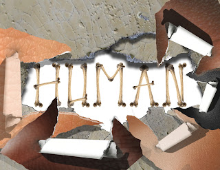
2 & 4. The concept behind these sketches is that underneath all of our different skin colors, we are all human. Taking actual images of skin and creating a layer mask to show the skin being peeled back would reveal the words underneath. Using textures and shadows to create depth and the layers under the skin. Once I got started with these concepts in Photoshop, they were not coming together as I had originally hoped. The concept wasn't coming across clear enough.

5. In this sketch, I took the definition of human and picture it overlaying different skin tones. The words will create the unity between the text and layers in the background. The font would be a typical dictionary font with shadows cast on the skin tones. The text would be crisp as well and the images of skin would be zoomed in to show details such as pores so people could recognize the texture.
6. Using the same textures from the ideas in sketches 2,4 and 5, I would have the word human in all directions in all different skin tones. With the concept that no matter which way you put it, or what color it is, the word remains the same.
7,8 &9 Issue: Abuse-
7. A child (bright in color) crouched in a dark corner with the insulting words blasting down from the opposing corner. The text would be harsh and spread to create the darkness surrounding the child. A large profile of an adult in the top corner, colored in a deep red with a screaming mouth spewing the words towards the child.
8. This sketch shows the idea of a woman, dressed in a clean and tailored suit. With a layer, create the clothing as a layer with a low opacity to reveal the bruises and abuse hidden underneath. This poster would show how abuse should not be kept hidden. Harsh words radiating off of the beautiful woman.
Possibly using gray tones for the clothing, color for the marks and abuse and reds for the words.
9. The concept behind this sketch is that children that are abused are afraid to tell anyone. It would show a child holding a stuffed animal and sharing the secret and tears with the stuffed animal. The text would say "shhhhh" in a soft font to represent that the secret should not be heard. A general darkness to the poster as secrets tend to be dark.
10, 11 & 12 Issue: Homelessness (specifically veterans)-
The last 3 sketches are based on the same concept. They show a homeless veteran in different settings, 10: on a city bench, 11: in front of a memorial statue and 12: laying on the street under an American flag. Each would display a sign "homeless veteran". With images in the background of the past; medals, saluting soldier, where the veteran was a figure of honor...a hero. The message for these posters would be that these men and women served and protected our country, they should be protected from ending up homeless on the streets. The colors would be ranging hues from patriotic reds and blues to grays that are dark and gloomy. The text would be similar to what you would see hand written on a cardboard sign.
Thursday, March 31, 2016
Photomontage Part 2
1. "Sound Storm" - This is the final product I came up with based on concept sketch #1. A trumpet player encompassed with the feeling of the music that is fueled by the fire in his heart. Through adding multiple layers and adjusting the opacity and gradient of the shapes, I feel that I created the movement intended. I originally planned on a dark background during the sketching phase but realized once I started in Photoshop that a bright background emphasized the warmth and life of the image. The silhouette shows the image of a trumpet player yet has no detailed features. The silhouette was created using Adobe Illustrator, along with the music notes. The silhouette and music notes were created in Adobe Illustrator and all other shapes were manipulated in Photoshop.
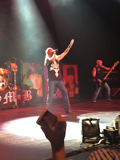
2. "For the love of fans"- This is based on my concept sketch #2. This was done by layering numerous photos I had taken in the past. By adjusting the hues and saturations of the individual photos, I was able to create one image that blends together. Also, I added numerous gradient masks to reduce the overlaps. I used deep yet bright colors to stick with the "rock" theme. The intent of this design was to show how the intense love from fans can intensify a performance. Dissolving the edge of the stage creates almost a rock like platform that the band members are up on...just out of reach from the fans touch.
Here are a few of the photos used:
I created a layer mask of this photo and removed some of the details/faces to emphasize the hands reaching out. Only a small portion of this photo shows in the final design.
I took the lights from this photo and removed everything else from the photo using the fill content aware option. This created a full layer of color for me to play with. I then used the gradient mask tool to fade the lights in.
I created an additional layer mask with this photo removing all of the background and foreground objects. In doing so I could manipulate the texture of the stage and figures so they could be incorporated with the other layers.
Tuesday, March 29, 2016
Photomontage Concept Sketches
Photomontage concept sketches
My thought process while brainstorming for this photomontage was to take the artist/band perspective. So I asked myself "How could music, fame, performing make an artist/band feel?"
Here are some of my concepts sketched out:
1."Sound Storm"-I wanted to show how the sound of a single musician can create a "storm" of sound that can fill a space with warmth. I envision swirls that transform from a low saturation and vibrance, to a bold and vibrant color showing warmth. The background would be dark, the trumpet player would be a silhouette with an inner glow centered at his heart. I see the music and feeling (expressed through the shapes) rotating around the trumpet player. Showing that the music can encompass you.
2. "For the love of fans"- In this sketch, I wanted to show how there can be such an intense feeling created through the love of fans. An artist/band doesn't reach a high level of fame without the adoration of fans. I see bold colors and dark shadows. The fans coming up through a haze. As if the singer is a God. I want to express how the fans showing praise emphasizes the intensity of a performance.
3. "Road to Fame"- This is the portrayal of a young musician heading out on a trip to fame. Using text to show the different challenges and experiences along the way. The concrete road will transform to a rough surface. At the end of the road will be images relating to fame and glory. At the bottom will be safety, possibly layered with net texture. The musician in a stance of trepidation.
3. "My Piano"- This concept is showing how the pianist holds his instrument high on a pedestal. Showing how an artist can be humble to the beauty of their instruments value. The curtains will be deep and rich, opening to show the world. Using layers and shadows to create a depth, as the sketch looks very 2 dimensional.
Subscribe to:
Comments (Atom)


