Inside Caitlin's Cranium
Wednesday, June 22, 2016
Module 6 Final
For the final project, I wanted to create a homepage to showcase the designs I created during this course. Making something that was visually appealing and representative of my current skills was my main goal. I used the final projects from each module as well as some other pieces that I had worked on through this learning process. I laid them out in a collage as the background for the page. I created an overlay where I set my text. I used the 3D tool to create interest in the text of my name so it would be interesting yet not over powering. I wanted the text tabs to appear as negative space in the semi transparent section in the center. I also inserted links to the social media sites that could be used as an alternative platform for my work. I found keeping the layout clean and easy to navigate would be beneficial.
Module 6 Sketches
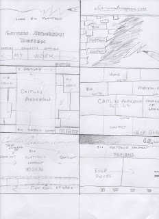
For the final module, I wanted to come up with some layouts that were easy to follow and visually appealing. Coming into it I thought it would be hard to sketch ideas for a design with just layout based components. I realized through the sketches that I was running through the tools of photoshop as I drew each sketch which really helped with the process. In the end I think I was uniform in most of my concepts. Emphasizing the presence of example work to draw the eye and simple tabs that would lead to more detailed examples and representations of my abilities.
Here is some of the layouts I started playing with:
Tuesday, June 7, 2016
Module 5 final
Here is my final design for the Avatar project. I wanted to create an avatar that gave the feeling of being a warrior. I wanted there to be an intensity in her eyes that showed power and strength. I used numerous layers to create the skin tone, shadows and highlights. Using techniques learned in the tutorials, I tried to make the "avatar" become the focus. I adjusted the brightness of the leaves to be a bit darker to contrast the brightness of the figure. I took the face mask, the head piece and the spears from other images and hopefully blended them well enough that they don't look foreign in the final design. I increased the size of her eyes, flattened her nose a bit and pointed her ear using manipulation tools such as feathering, liquefy and the resizing tool along with masks to get a cleaner look. In the end, with all the little pieces, it took 40 layers to come to this final image(I had to count them because I thought it was getting a little crazy).
This was a variation I liked also, it gave me the feeling of an ice princess or something along those lines. This was acquired by playing with the hue/saturation of different layers.
Here are some of the images I used:
This is the original photo I took of him along with some other images I used:
:
Sunday, June 5, 2016
Module 5 Sketches
These are the concepts I came up with for module 5. When I think about an avatar, I think of warriors and nature. I tried to incorporate that into my drawings. I emphasized the features on my avatar creatures and placed them in positions I would imagine they would be out in the woods. I would like to create an image which shows how they would be one with nature. Without showing color in the sketches I don't think they are as powerful as the final image will be but I know I will have a broad span of options when it comes to effects with color.
Sunday, May 22, 2016
Module 4 book cover
Here is what I came up with for my final design. I wanted to make the cover bright yet deep. I transformed the pupils texture into colorful piano keys by adding three different layer at different opacities. Using the dodge and burn tools to adjust the shadows in the eye made the added layers blend with the eye base. For the background I wanted there to also be texture but not be a distraction. So I used an image of concrete and an image of sheets of music. I made them black and white and the adjusted the contrast and brightness until it reached my desired outcome. I used an autograph as the text for my title as I felt it gave a personal connection to my artist. I allowed room on the back cover for a description of the book with the diagonal divide of the piano keys.
Saturday, May 21, 2016
Module 4 sketches
These are the concepts I came up with for the musicians book cover. I tried to incorporate the instrument in some layouts and then showcase the musician in others.
Concept 1- Pianist:
In the first sketch I thought I would deconstruct and just use the keys of the piano with a 3d effect to create texture and draw the eye of a reader. The second would be the journey of the pianist with the keys as the path. The third, looking into the eye of the pianist with musical graphics in the background. The forth, a simplistic approach, a piano in the spotlight with aged hands on the keys as the back cover.
Concept 2- Violinist:
In the first sketch, a violin leaning in the corner with a spotlight on it, the back cover a close up of the violin. The second, a red book with a silhouette of a violin, details showing in sketched white. The back cover would show the neck of the violin with the same coloring and effects as the front. The third, splitting the violin down the spine of the book allowing room for text on front and back. The violin would be rich in color with a dark background to create contrast. The forth, a non detailed violinist with a paint texture, stroked of bright colors emphasizing the highlights. The back cover would be a close up with a bit more details showing a faint smile but still having the paint stroke effect.
Concept 3- Guitarist
The first, an eye catching guitar with bold color and graphics. The title in neon lights which would coordinate with the back cover showing a ad for the artist. The second concept would be a guitar pick with the artists name. A road map in the background showing that the book will take you on the journey. The back cover would be textured with guitar picks with the cities on the tour. The next concept would be the artist, holding his guitar, I'm still undecided on the background for this cover, could be in the middle of a field, or just a solid color. The back cover would be the lone stool with the mic in the spot light. My final concept is of a guitarist resting under a tree which would go up the spine. The guitar on the front cover, the artist on the back. Creating two different visuals that tie together when looked at as a whole.
Tuesday, April 19, 2016
Module 3 Poster

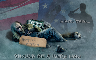
This is the final design I came up with for the Awareness Poster project. This poster shows a veteran sinking into the streets of homelessness. With a silhouette of himself in his youth in the background saluting the flag. Once looked at as a hero, now looked at as a nuisance. I used an image of a homeless man and added the sign to link him to the concept. I removed the background from the image and blended him in with the other layers to bring it together. I created shadows underneath the man so he did not look like he was floating in the center of the poster. I used the multiply tool to add the layer of the saluting soldier as it originally was a very bright image, as well as the flag. Using the burn and dodge tools I tried to balance out the texture of the ground. The font used was titled "felt tip senior" which I found to be fitting for this design. I hovered the text "A HERO THEN.." over the silhouette to connect the text to the idea and the remaining text in the foreground to emphasize the message. I added the cardboard on the diagonal as I thought it need something more to fill in the empty space, so I put it here both ways for opinions.
Subscribe to:
Comments (Atom)


